

The Kit Locker Logo Design
The Kit Locker Logo Design
The Kit Locker Logo Design
The Kit Locker
1 Week
Logo Design
The Kit Locker
1 Week
Logo Design
The Kit Locker
1 Week
Logo Design
Introduction
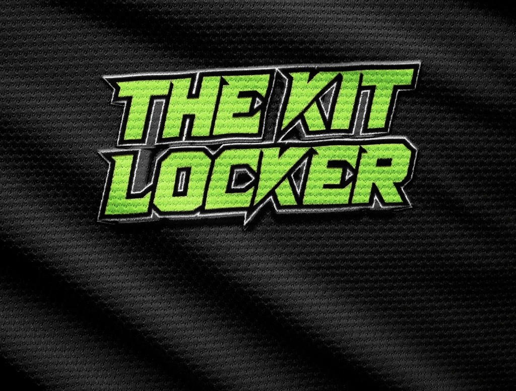
The Kit Locker, an online retailer specialising in football shirts, sought a clean and bold logo that aligned with sports brands. This case study highlights the process and outcomes of designing The Kit Locker's logo.
Client Background
The Kit Locker focuses on selling football shirts through their social platform. They desired a logo that represented their brand identity and conveyed their association with the sports industry.
Logo Design
To create The Kit Locker's logo, I aimed for a clean and bold design that resonated with sports brands. I utilised elements commonly found in sports logos, such as strong typography associated with football.
The colour palette consisted of a vibrant and energetic green, often seen in the sports industry. This colour helped to evoke a sense of excitement and passion, capturing the spirit of football.
Result and Impact
The designed logo for The Kit Locker successfully captured the essence of sports brands while reflecting the business's focus on football shirts. The clean and bold design resonated with customers, conveying a professional and trustworthy image.
The logo played a vital role in establishing brand recognition and recall. It's become a powerful visual representation of The Kit Locker, allowing customers to easily identify and connect with the brand.
Conclusion
The logo designed for The Kit Locker aligned with their vision of a clean and bold design inline with sports brands. The logo became an integral part of the brand's identity, contributing to their recognition and establishing a strong presence in the football shirt retail market.
Introduction
The Kit Locker, an online retailer specialising in football shirts, sought a clean and bold logo that aligned with sports brands. This case study highlights the process and outcomes of designing The Kit Locker's logo.
Client Background
The Kit Locker focuses on selling football shirts through their social platform. They desired a logo that represented their brand identity and conveyed their association with the sports industry.
Logo Design
To create The Kit Locker's logo, I aimed for a clean and bold design that resonated with sports brands. I utilised elements commonly found in sports logos, such as strong typography associated with football.
The colour palette consisted of a vibrant and energetic green, often seen in the sports industry. This colour helped to evoke a sense of excitement and passion, capturing the spirit of football.
Result and Impact
The designed logo for The Kit Locker successfully captured the essence of sports brands while reflecting the business's focus on football shirts. The clean and bold design resonated with customers, conveying a professional and trustworthy image.
The logo played a vital role in establishing brand recognition and recall. It's become a powerful visual representation of The Kit Locker, allowing customers to easily identify and connect with the brand.
Conclusion
The logo designed for The Kit Locker aligned with their vision of a clean and bold design inline with sports brands. The logo became an integral part of the brand's identity, contributing to their recognition and establishing a strong presence in the football shirt retail market.
Other Projects

© SwavyX LTD 2024. All Rights Reserved.
© SwavyX LTD 2024. All Rights Reserved.